
Showing posts with label Chart of the Day. Show all posts
Showing posts with label Chart of the Day. Show all posts
Monday, May 4, 2015
Wednesday, December 17, 2014
Chart of the Day: Obama's Memorandums...
Liberal pundits love to claim Barack Obama hasn't issued any more EO's than other Presidents. That is technically true, although many of his EO's have been more significant in scope. EO's are the method Obama prefers for usurping the power of Congress. Obama prefers to just issue a meme. He hasn't actually issued an EO for his illegal immigration amnesty program. It's being implemented by memos.
Via USA Today:

Via USA Today:
Saturday, August 2, 2014

Thursday, July 10, 2014

Tuesday, May 20, 2014
Chart of the Day: No Global Warming in 212 Months

That is 17 years and nine months...
According to the RSS satellite data, whose value for April 2014 is just in, the global warming trend in the 17 years 9 months since August 1996 is zero. The 212 months without global warming represents more than half the 423-month satellite data record, which began in January 1979. No one now in high school has lived through global warming.
Tuesday, May 6, 2014

Wednesday, April 23, 2014
Chart of the Day: Ronald Reagan vs. Barack Obama Recovery...

When Ronald Reagan took over from Jimmy Carter in ’81, things were actually worse economically compared to when Obama took over from George W. Bush in ’08.
Consider these three important comparisons of economic indicators, then and now:
- Unemployment was at 10.8% versus 7.7%
- Inflation (Consumer Price Index) was at 13.5% versus 2.7%
- Interest rates (prime rate) was at 21.5% versus 3.25%
Tuesday, April 8, 2014

Friday, May 31, 2013

Sunday, April 28, 2013
Chart of the Day: Second Coldest March/April US History

Undoubtedly, climate change advocates will claim this chart result is caused by CO2 and global warming...
Friday, April 12, 2013
Chart of the Day: Doubling the National Debt...

Via WSJ:
President Obama is pitching his new budget proposal as a fiscal peace offering to Republicans, but the details suggest everyone should expect more conflict. The fiscal 2014 plan he released Wednesday is a very slightly modified version of his previous budgets that reduces the deficit by raising taxes and trading defense cuts for more domestic spending.
The real news is that his budget ratifies much of the spending increase of the first term and tries to lock it in. He wants the feds to spend $3.78 trillion next year ($11,944 per American), which would still be 22.2% of national output nearly four years into an economic recovery. Before the financial panic in 2008, the government was spending about $1 trillion less, or closer to $2.7 trillion a year and an average of 20% of GDP—and President Bush was no slouch as a spender himself.
Mr. Obama wants federal spending to grow to $4.45 trillion by 2018 fueled mostly by the exploding costs of his Affordable Care Act. This spending surge appears smaller than it is only because the government will bank large reductions in military spending as the Iraq and Afghanistan wars wind down. But unlike in the 1990s, this peace dividend will be spent.
Keep on reading…
Thursday, March 28, 2013
Interesting Chart of the Day: Social Security Disability Applications vs. Unemployment Rate...
In an honest world, there wouldn't be any correlation between unemployment and Social Security disability applications. A bad labor market makes it hard to find a job. It doesn't make people unable to work physically or mentally.
Via The Atlantic:

Fun fact of the Day: We spend more tax dollars on disability than welfare and food stamps combined.
Via The Atlantic:

Fun fact of the Day: We spend more tax dollars on disability than welfare and food stamps combined.
Friday, February 15, 2013
Chart of the Day: How Obama bought the election...
Check out the difference in ad impressions between Obama and Romney.


Sunday, December 9, 2012

Sunday, November 18, 2012
Chart of the Day: Inflation-Adjusted Gross Domestic Product After Recessions...
Very scary chart for our long-term economy...
Via WONKBLOG:
Via WONKBLOG:
A new study from the Congressional Budget Office starts with the scariest graph you’ll see today.
In other words, you’re not imagining it: This economic recovery has been a big disappointment relative to what the United States has usually experienced after a recession.
Source: Congressional Budget Office

Sunday, September 23, 2012
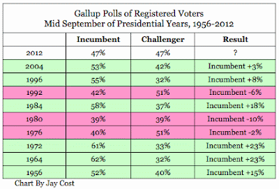
Chart of the Day: Incumbent President September polling election results
Every incumbent President polling below 50% in September has lost. Obummer is at 47%...

Saturday, September 22, 2012

Thursday, August 9, 2012

Friday, July 6, 2012

Sunday, June 17, 2012
Chart of the Day: Adjusted vs. Unadjusted Temperature Trend
The unadjusted trend shows an eighty year cooling trend. The corrupted adjusted trend shows one hundred and twenty years of warming.
Via Real Science:

Via Real Science:

Subscribe to:
Comments (Atom)